

Wednesday, December 2, 2009
Tuesday, December 1, 2009


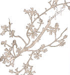
Wednesday, October 28, 2009
so you think you can draw... a haunted halloween house!

i have so many favorite eerie tales - it was so hard for me to choose which one to use as inspiration...
because of it's length, as most of my favorites are too long for this assignment, i chose the first few lines form Paul Laurence Dunbar's "The Haunted Oak".
Friday, October 9, 2009


Wednesday, September 30, 2009

Monday, September 28, 2009

Thursday, September 24, 2009


Tuesday, September 15, 2009

Thursday, September 3, 2009

Tuesday, September 1, 2009

Thursday, April 2, 2009
trading spaces
we were to trade our spaces with a neighbor and remodel it into our style.
this is my version of cassandra's space.

it's what's on the [inside] that counts
with a given wall of 12' x 36' we were to create an open interior space with a kitchen, eating, and entertaining area at a one point perspective
[more images on the way]


Sunday, March 8, 2009

Tuesday, March 3, 2009
detail [curry]

while other members of my group focused on columns, iron work, etc, i zoomed in on a window on the curry building's facade... i made sure to show the contrast between the smooth frame, molding, and keystone, and the rough brick surrounding them.
Thursday, February 26, 2009
did i even eat last night...?
 class warm-up: draw last night's dinner
yes! for once i DID find time to fix dinner!
Monday, February 23, 2009
divide & conquer [five perspective sketches]
[top three...]


[curry building: east exterior]
i love the loose sketchy, yet detailed style of the stone building example and the way it depicts the surface of the building.
i've always sketched with detail and a pencil, and shading, but this is my first time back to this style since we began drawing in pen so much. I really like this and it makes me miss drawing with pencil...
 [example 2 link]
[curry building: main entrance interior]
as the example above uses line weight to show hierarchy, i tried
mixing pencil and pen, as well as contour and gestural lines, to show a similar view of the front lobby. there's not as much contrast as the example, but I still like the subtle mix...
 [example 3 link]

mixing pencil and pen, as well as contour and gestural lines, to show a similar view of the front lobby. there's not as much contrast as the example, but I still like the subtle mix...
 [example 3 link]
[curry building: stairwell]
the cross contouring in the example helps define the planes of the surfaces in that bathroom, and i thought that drawing a space like a stairwell could use some directional lines as well...
and i love this one! again, i went back to my pencil and also used a straight edge to map it out while using crosshatching to give depth, shape, and orientation.
and i love this one! again, i went back to my pencil and also used a straight edge to map it out while using crosshatching to give depth, shape, and orientation.
[the other two...]

[curry building: facade]
here i tried another gestural contour playing with tight and loose lines. I like the composition a lot, with the plants in front and the building climbing up from behind.

[curry building: east exterior]
this one's my least favorite - i wanted to capture the area i travel every time I go to the curry building, but my contours in this one seem weak
Subscribe to:
Posts (Atom)


![[example 1 link]](http://z.about.com/d/drawsketch/1/0/9/L/stonehouse.JPG)
![[example 2 link]](http://www.johngalelandscapes.com/USERIMAGES/Windmill%20Lane%20-%20perspective.jpg)
![[example 3 link]](http://www.meganthompson.com/wp-content/uploads/2008/02/penandink.jpg)